In home design, few choices impact the mood of a room more than the colors you surround yourself with. When crafting a cozy color palette for your interiors, two camps often emerge: the warm neutral lovers and the cool gray enthusiasts.
Both palettes can make a space feel inviting, but in different ways. Warm neutrals envelop you like a soft blanket on a chilly evening, while cool grays evoke the calm of a misty morning. How do you know which palette is right for your home?
This comprehensive guide will compare warm neutral tones versus cool gray shades, explore how each creates coziness, and help you choose the perfect hues for your style, region, and needs.
Cozy Color Palette FAQ
What are warm neutral colors in home décor?
Warm neutral colors are shades that have yellow, red, or brown undertones, giving them a cozy, earthy quality. In home décor, popular warm neutrals include beige, ivory, cream, tan, taupe, and soft brown tones. These colors are called “neutral” because they’re not intense or saturated (like a bright red or blue), but their warm undertones add a sense of warmth and comfort. For example, beige or taupe walls can create a snug, inviting atmosphere compared to pure white. Warm neutrals often remind us of natural elements. Think of sandy beaches, oatmeal, terracotta clay, or a cup of cocoa. They tend to pair well with other warm accents (like wood furniture or brass lamps) and are great for making a space feel homey and intimate.
What counts as a cool gray color, and why is it “cool”?
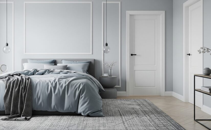
Cool gray colors are gray shades with blue, green, or purple undertones, which give them a cooler (think icy or watery) cast. When we call a gray “cool,” we mean it has a bit of those cool-tone colors mixed in. For example, a paint color might be a light gray with a subtle blue hint. On the wall it might look like a pale misty gray. Common cool grays range from silvery hues to deep charcoals that have a blueish or neutral base. They are termed “cool” because they evoke feelings of water, sky, or stone, and can make a space feel calm and fresh. In contrast, a “warm gray” (often called greige) has a touch of brown or beige, making it feel cozier. You can identify a cool gray by holding it next to something pure white. A cool gray will typically show a slight blue or green tint by comparison. These cool grays are popular in modern and minimalist decor because they provide an elegant, serene backdrop that’s not as stark as pure black or white.
Are gray interiors still in style, or are they going out of fashion?
Gray interiors had a huge wave of popularity in the 2010s, and while the all-gray trend is evolving, gray itself is a classic neutral that isn’t truly “out.” What’s happening now is that designers and homeowners are moving toward warmer neutrals (like beiges, creams, and earthy tones) after so many years of cool gray dominance. In 2024 and beyond, you’ll see more spaces painted in greiges, taupes, and warm whites, often because people want a bit more warmth and personality. However, gray is still very much in use. It’s considered a timeless neutral. The key is how you use it. The trend of painting everything flat builder-grade gray is diminishing, but cool gray accents and mixed palettes are still chic. In fact, designers often now pair gray with warmer elements to avoid a cold look. So, if you love gray, you can absolutely keep it in your home. Consider incorporating some warm touches (wood, colorful art, or textiles) to give the room depth. Basically, fully gray interiors are being supplanted by warmer, cozier vibes for many people, but gray itself has earned a place as a go-to color that can be very stylish when balanced well. It’s all about personal preference. Do what makes your space feel like home!
How can I make a cool gray room feel cozy instead of cold?
Great question! If you have a lot of gray in a room and worry it feels cold, there are several easy tricks to cozy it up:
1. Add Warm Textiles: Incorporate throw blankets, cushions or rugs in warm colors or warm neutrals (like a cream knit throw, a beige or rust-colored pillow, or a taupe shag rug). Soft textures like chunky knits, faux fur, or wool immediately add warmth both visually and physically.
2. Use Wood and Natural Elements: Wood tones are warm by nature. A wooden coffee table, sideboard, or even wicker baskets and plants can break up the gray. Even a tray or lamp base in brass, wood, or woven rattan on a gray background creates a warmer focal point.
3. Adjust Lighting: Swap cool-white light bulbs for warm-white bulbs. Warm lighting (around 2700K) will cast a cozier glow over gray walls, reducing any stark or sterile feel. Use table and floor lamps to create gentle pools of light. Consider candles for an extra cozy touch in the evenings (flameless LED candles also give a warm flicker).
4. Introduce a Pop of Color: A bit of color in a mostly gray room can add life. Warm colors like mustard yellow, burnt orange, blush pink, or even a soft red in small doses (say a piece of art or a throw pillow) will warm up the palette. Even a bowl of oranges or a vase of yellow flowers on a gray countertop cheers it up!
5. Mix in Warmer Neutrals: You don’t have to go full contrast – even adding some beige or greige elements can help. For instance, off-white drapes instead of pure white, or an ivory headboard against a gray wall, can slightly warm the scene. A gray sofa can get beige throw pillows or vice versa.
6. Texture and Pattern: Sometimes a gray room feels cold because everything is smooth and monochrome. Add textured pillows, a patterned fabric, or even an accent wall with texture. These layers create visual interest and warmth.
By combining a few of these tricks, you maintain the elegant calm of your cool gray room while ensuring it feels inviting and cozy. It’s amazing how a soft chunky blanket over a gray couch and a warm lamp in the corner can transform the atmosphere!
Can I mix warm and cool colors together in one room?
Absolutely! Mixing warm and cool tones in the same space is not only possible, it often creates the most rich and comfortable designs. Design professionals do this all the time to achieve balance and contrast. For example, you might have cool gray walls but furnish the room with a warm camel-colored sofa and gold accents. Or you could have a warm beige wall paired with a navy (cool) rug and some black (cool-neutral) metal light fixtures. The key is to get the right ratio and repetition:
– Use one as dominant and the other as accent. Many decorators follow an 80/20 guideline. Have about 80% of the room one temperature and 20% the other. So in a primarily warm room, you might sprinkle in some cool elements (say, a cool blue artwork and a gray throw). In a mostly cool room, bring in a few warm touches (a wooden side table and a couple of tan pillows). This way the mix looks intentional.
– **Repeat colors to unify.** If you introduce a warm color in a cool room, use it at least twice. For instance, a gray (cool) bedroom with one orange (warm) pillow might seem out of place, but if you also have a bit of orange in artwork or another decor item, it ties together.
– **Neutrals can bridge the gap.** White, black, and certain greiges are great “connectors” between warm and cool pieces. A black metal lamp (neutral) can sit on a warm wood table next to a cool gray wall and it all works.
Mixing warms and cools actually makes a room feel more “alive” and layered, as opposed to everything being matchy-matchy. Just keep some cohesion by echoing each color elsewhere in the space. Don’t be afraid to try combinations. Often a touch of opposite temperature will enhance the cozy factor. The result can be really dynamic and cozy, because you’re harnessing the energy of both sides of the spectrum.
The Appeal of Warm Neutral Palettes (Beige, Taupe & More)
Warm neutral colors include shades like beige, cream, tan, taupe, camel, and soft brown. Essentially neutrals with red, yellow, or brown undertones. These hues are associated with sunshine, fire, and earth. Which is why they naturally radiate warmth and comfort.
When you paint your walls a creamy beige or fill a room with honey-toned wood and caramel accents. The space can feel like it’s glowing with gentle heat. Warm neutrals tend to create a cozy, intimate atmosphere, making large rooms feel inviting and empty corners feel snug.

Warm neutrals are timeless and versatile. They often have a classic, comfortable vibe that pairs well with traditional decor. As well as modern styles that aim for a welcoming look.
For example, painting a family room in a rich ivory or light mocha can instantly make the space feel “homey” and relaxing.
It’s no surprise that interior designers frequently use warm neutrals in living rooms and kitchens, where you want to encourage people to gather and linger. Warmer hues literally help “warm up” a space, both visually and psychologically. Which is especially beneficial in expansive or sparsely furnished rooms that might otherwise feel cold.
In fact, warmer paint colors are often recommended to make large, open-concept spaces feel more inviting. They also can brighten dim rooms by reflecting a cozy glow. As long as you choose lighter warm shades in low-light areas.
Beyond their coziness, warm neutrals are making a major comeback in design trends. After a decade dominated by cool gray everything, homeowners are craving the earthy comfort of warm tones again.
Design forecasts for 2024–2025 highlight a shift from cool grays to welcoming warm neutrals in home décor. Those taupes, beiges, and soft terracottas that might have seemed old-fashioned ten years ago are now everywhere! Adding warmth and personality that gray sometimes lacks.
Warm neutrals bring a bit of nature indoors. The browns of wooden beams, the beige of natural linen, the terracotta of clay. Thus making rooms feel alive and comforting instead of sterile.
There’s even some psychology at play. Earth-tone colors have been shown to reduce stress. They even create a sense of security and stability in a room. No wonder designers and homeowners alike are gravitating toward these cozy hues to turn houses into welcoming havens.
To put it simply, a warm neutral palette wraps your home in a gentle embrace. It’s soothing, personable, and mood-lifting.
If you love the idea of your living spaces feeling like a warm hug. Or if you have memories of Grandma’s inviting beige kitchen. Warm neutrals might be your ideal starting point for a cozy palette.
Examples of Cozy Warm Neutral Colors
- Beige and Tan: Classic light neutrals that pair with anything. They reflect light well and never go out of style.
- Creamy Whites: Off-whites with yellow or brown undertones feel warmer than stark white and create a softer, cozier brightness.
- Taupe and Greige: These straddle gray and beige. Taupe has a hint of brown/purple, greige mixes gray with beige. They’re warm-leaning neutrals that add sophistication while remaining cozy. Popular picks like Sherwin-Williams “Agreeable Gray” are really greige tones that give a “cozy, classic, and comfortable vibe”.
- Terracotta and Clay: Sun-baked earthy neutrals with red/orange undertones. Used in moderation, they infuse a room with warmth and rustic charm. Instantly cozying up the atmosphere.
- Warm Browns and Caramels: Natural wood tones, leather, and chocolate-brown accents ground a space and convey warmth. A walnut coffee table or camel leather armchair in a beige room adds depth while keeping the palette snug and earthy.
(Tip: When using warm neutrals on walls, test how they look in your lighting. Natural light and bulb temperature can shift how warm or cool a neutral appears. For instance, a beige with subtle pink undertones might look more pronounced in the afternoon sun. But generally, warm neutrals tend to maintain a welcoming glow even as lighting changes throughout the day.)
The Allure of Cool Gray Palettes (Silver, Charcoal & Co.)
On the flip side of the color wheel, we have the cool grays and neutral blues. Cool colors are characterized by blue, green, or purple undertones, and in the world of neutrals that means shades of gray, slate, pewter, steel, and charcoal.
These colors are reminiscent of overcast skies, smooth concrete, and soft fog. Bringing with them a sense of calm, modernity, and sophistication. A cool gray palette can transform your home into a serene retreat with a contemporary edge.
Cool grays rose to superstar status in interior design over the past decade. From silvery paints to charcoal sofas, gray became the go-to neutral for a clean, modern aesthetic. And it’s easy to see why. Gray is incredibly versatile. It pairs beautifully with crisp white trim for a classic contrast, or with black and metal accents for an industrial chic look.
Cool gray walls create a gallery-like backdrop that lets colorful artwork or furniture pop. This neutrality and adaptability made gray a safe choice for many homeowners and stagers looking for a universally appealing look.
So how do cool grays create coziness?
At first thought, “cozy” might not be the word you associate with gray. Some people find all-gray rooms a bit cold or impersonal if done poorly. But cozy doesn’t always mean warm. It can also describe the feeling of tranquility and uncluttered ease that cool palettes offer.
Cool gray tones excel at making a space feel calm, clean, and restful. Think of a pale gray bedroom that reminds you of a quiet cloudy morning, inviting you to curl up with a book, or a soft slate-blue living room that feels like a breezy seaside cottage. These environments are cozy in the sense that they promote relaxation and serenity.

Cool neutral palettes often feel “airy” and expansive, which can be an advantage in smaller rooms or those with lower ceilings. Because cooler colors tend to recede visually. They can make a room appear larger and more open.
If you have a compact living space or a narrow hallway, painting the walls a light cool gray or bluish-gray can create the impression of depth, helping the area feel less cramped. The same goes for spaces where you want a fresh, bright vibe . Cool colors evoke open sky and water, so they can lend a refreshing atmosphere.
This is one reason coastal and spa-inspired interiors often feature cool neutral schemes. Designers note that cool gray colors work wonderfully for coastal decor or spa-like settings, giving a light and fresh look.
Another benefit: cool grays are inherently elegant and refined. A monochromatic gray scheme with layered tones can look very high-end and put together. Many modern and minimalist designs use cool neutrals to achieve that uncluttered, zen feeling.
If your style leans towards contemporary, urban, or ultra-modern. You might naturally be drawn to the sleek vibe of cool gray. These hues have a more formal and structured feel compared to the casual comfort of warm tones. Which isn’t a bad thing. It just means cool palettes can make a space feel polished.
For instance, a formal dining room in a deep charcoal gray with white wainscoting will feel calm, dignified, and conducive to intimate dinner parties. A light gray home office can inspire focus and clarity. Creating a sense of cool concentration ideal for productivity.
However, it’s worth acknowledging the common concern. Can a gray-heavy room feel cozy, or will it feel like a cold cave?
The key is in how you use cool grays. By themselves, too many flat grays could indeed feel sterile. The trick is to add texture, softness, and a few contrasting touches.
If you love the idea of a gray living room. Choose a plush fabric sofa in charcoal. Layer on chunky knit throw blankets. Incorporate natural elements like a jute rug or wooden coffee table (introducing a bit of warmth). And use warm lighting (lamps with soft white/yellow glow). These additions will cozy up a cool palette immensely.
You can also mix in warmer neutrals as accents. For example. A set of beige linen curtains or a tan leather ottoman in a gray room gives the eye a warm break and adds depth.
Design experts often follow an 80/20 rule when balancing warm and cool. Use one temperature as about 80% of your scheme and the other as 20% for contrast. So, if 80% of your living room is cool gray (walls, large furniture). Make sure about 20% is something warmer (wood tones, brass accents, a cream-colored throw). This prevents the space from feeling icy and actually heightens the coziness by providing balance.
In summary, cool grays can absolutely be cozy. But in a calming, modern, and understated way. They’re perfect if you want your home to feel like a peaceful retreat. Or if you adore a minimalist look but still want comfort. By paying attention to lighting and mixing materials. You can avoid the “too cold” trap and enjoy the best of both worlds. A space that is crisp yet comfortable.
Examples of Cozy Cool Gray Colors
- Soft Gray-Blue (“Greige-Blue”): Hints of blue or green in a light gray bring a whisper of color while keeping things neutral. These colors often appear in coastal designs. Picture a pale gray with a seafoam undertone for a spa-like bathroom.
- True Cool Gray: A pure gray with blue undertones. Common examples are paints like Benjamin Moore “Stonington Gray” or Sherwin-Williams “Passive”. These types of grays give an airy, fresh look and are popular for open-plan spaces. They work well with bright white trim and can make a room feel expansive.
- Deep Charcoal or Graphite: Dark cool grays can cozy up a space by making it feel enclosed in a good way. A charcoal wall behind the bed, paired with soft lighting. Can actually feel very cocoon-like and intimate at night. Just be sure to balance dark grays with lighter elements so the room isn’t too dark overall.
- Gray with Purple Undertones: Some cool grays carry a touch of purple or lavender. These can add a subtle richness and almost a romantic mood to a room. For example, a light french gray with a violet base can make a bedroom feel dreamy. Be careful though. A strong purple undertone might not read as neutral, so test samples to get the effect you want.
- Cool Off-Whites: Not all whites are warm! A white paint with a hint of blue or black can actually read as a very light gray. These cool whites (like “icy white” or “snowdrift”) provide a clean backdrop that’s less stark than pure white but still very fresh. They can be lovely for a bright, serene look in smaller spaces.
(Tip: To identify if a gray is warm or cool, look at its undertone. Cool grays will have bluish or greenish hints, whereas warm grays (greiges) have yellow/brown undertones. For example, a “neutral gray” with no strong undertone will just look gray. Add a touch of blue and it becomes a cool slate. Add a touch of beige and it becomes greige. Many paint swatches or descriptions from manufacturers like Benjamin Moore or Sherwin-Williams will note the undertone. As The Spruce explains. A cool gray has more blue, a warm gray more yellow/brown, and that’s why greige typically feels warmer and cozier.)
Regional Differences: East Coast vs. West Coast Cozy Colors
Did you know that where you live might influence which colors feel “cozy” or stylish to you?
In the United States, different regions have traditionally embraced different palettes. Shaped by climate, architecture, and cultural tastes. When choosing between warm neutrals and cool grays, it can be enlightening to consider these regional aesthetic differences.
Let’s explore the classic example: East Coast vs. West Coast preferences. And how each can still achieve coziness.
East Coast Homes (think New England, Mid-Atlantic, etc.) often have a design heritage that leans classic, rich, and structured. Historic East Coast houses endured long, cold winters. Their interiors reflect a desire for warmth and comfort during those dreary months. It’s common to see warmer color schemes in these homes. Not just neutrals but even deep accent colors like navy, hunter green, or burgundy paired with ivory or beige. When it comes to neutrals, East Coasters tend to favor creamier whites, warm beiges, and crisp ivories over stark white or ultra-modern gray. These tones complement the region’s many traditional colonial and Victorian-style homes, bringing out their character.
As one design expert noted, the Northeast appreciates neutrals that have a warmer take on white, replacing overly stark whites with softer stone and sand tones.
Additionally, East Coast designers report that their clients often prefer “cleaner and crisper shades” in comparison to muddy earth tones. Which can translate to a love for classic neutrals combined with rich warm accents.
Essentially, East Coast style finds coziness through a balance of timeless elegance and warmth: imagine a Boston brownstone living room with cream-colored walls. A dark blue accent chair, brass lamps, and mahogany wood. That mix of warm neutrals with pops of color creates an inviting yet refined space.
Contrast that with West Coast Homes (California, Pacific Northwest, etc.). Which embody a more laid-back, airy, and nature-inspired vibe. West Coast interiors often blur the line between indoors and outdoors. Sunny California rooms flow out to patios, and Seattle homes incorporate lots of natural wood and light.
The color palettes here pull directly from nature’s neutrals: whites, soft beiges, sand tones, and earthy browns drawn from beaches, deserts, and mountains.
In fact, popular West Coast design schemes are based on simple neutral foundations. White walls, creamy linen upholstery, light wood floors – with greenery and textures adding life. These neutrals are typically warm or mid-tone neutrals rather than cool, steely grays.
Terracotta, sage green, and dusty blues often appear as accents, reflecting the coastal landscapes and sunsets.
According to designers, “on the West Coast, especially in California, we’re seeing a laid-back, sun-washed aesthetic with soft earth tones, warm terracottas, and faded coastal blues”. That blend indoor-outdoor living.
There’s a clear preference for earthy, warm color schemes out West. To the point where some colors that West Coast clients love might feel out of place for more traditional East Coast tastes.
The abundance of natural light in many western locales also means interior colors won’t be too dark or heavy. Light, airy tones rule the day so as not to overwhelm the bright spaces.
For example, a modern Los Angeles family room might have white walls. A mix of beige and gray furniture. And lots of jute, rattan, or terracotta decor for texture. The effect is a breezy, relaxed coziness. Not in a piled-on-fabrics way, but in a simplicity meets comfort way.
It’s fascinating to see these differences. East Coast cozy might mean a warmly painted library with oak furniture and a crackling fireplace. Whereas West Coast cozy might be a light-filled great room. With a plush ivory couch, bamboo shades, and a cactus in the corner. Both coasts value comfort, but how they achieve it color-wise can differ.
Of course, these are general trends. You’ll find cool modern apartments in New York and rustic warm cabins in California, too. And many people enjoy blending styles from both coasts for a unique look. Mixing warm and cool elements, old and new.
If you’re torn between warm neutrals and cool grays. Considering your geographic and climatic context can provide guidance.
Colder, darker climate? You might lean toward those warm tones to subconsciously counteract the chill outside. It’s no coincidence that East Coast and Midwest homeowners often opt for “cozy, grounded palettes. Such as, taupe, deep greens, and warm neutrals that suit the climate”.
Hot, sunny climate? A cooler palette might actually feel more refreshing. People in warm regions sometimes favor breezy blues and grays to create a sanctuary from the heat.
For example, if you live in Florida or Southern California. Painting your home all beige might make the summer heat feel stifling. Whereas pale gray or seafoam walls could psychologically cool things down.
Light quality also matters. Northern light is cooler and can make cool colors look icier. So, a north-facing room in Boston might do better with a warm neutral. Southern light is warm and can wash out some colors. So, a south-facing room in Phoenix might welcome a cooler gray to balance the natural warmth.
In the end, these regional tendencies are interesting guidelines, but not strict rules. You don’t have to live in Maine to paint your living room beige. And you won’t be drummed out of California for loving a cozy crimson dining room. It’s all about what makes you feel at home.
However, if you do like to take cues from your surroundings. Think about borrowing from your region’s palette. East Coast elegance with warm neutrals and classic contrasts. Or West Coast serenity with light neutrals and natural textures. You can’t go wrong either way. Both can be used to create an incredibly cozy palette suited to your life.
(Fun fact: Regardless of coast. Neutral palettes are a realtor’s favorite for resale. Homes on both coasts often get a fresh coat of neutral paint before hitting the market, since it gives a clean slate. So whether you choose warm or cool neutrals. Know that a tasteful neutral palette tends to have broad appeal.)
How to Choose the Right Cozy Palette for Your Home
Now that we’ve explored the qualities of warm vs. cool neutrals and even how geography can sway our color cravings, it’s time to get practical.
How do you decide which palette is right for your space? Here are some key factors and tips to guide your choice:
1. Consider Your Room’s Lighting and Size
Lighting is perhaps the most important factor when picking paint colors. A color that feels cozy in one setting could fall flat in another simply due to light. Generally, warm colors help a space feel warmer (duh!) and can counterbalance cool light. While cool colors can calm a space and counter very warm light.
- North-facing or low-light rooms: These spaces get cooler, bluish natural light. A cool gray in a north-facing room can double down on the chill and look dull or icy. Warm neutrals shine in these conditions. They add the warmth that natural light lacks. For example, a small den with one north window might feel dreary in shadowy gray. But put a creamy cappuccino color on the walls and it will instantly cozy up. Warm neutrals also tend to reflect whatever light is available with a soft glow. Preventing the room from feeling cave-like. If you do use a cool color in a low-light room. Lean toward a lighter hue with a hint of warmth (like a greige or a gray with slight lavender undertone). Thus avoiding the “cold” feeling. Also, rely on warm artificial lighting (lamps with warm bulbs around 2700K) to compensate. Remember, light bulbs with lower temperature cast a warmer, cozier light.
- South-facing or bright, sunny rooms: These get an abundance of warm light all day. Warm colors can look even more intense here. Your beige might turn almost yellow at noon. That’s why cooler neutrals often excel in sunlit rooms. They balance the natural warmth and can make bright spaces feel more comfortable. A light cool gray or a stony blue undertone paint will appear neutral and soft in strong sun. Whereas a dark warm color might become overpowering. Cool tones also won’t fade as quickly under intense sunlight. However, if you love warm neutrals and have a sunny room. Consider lighter warm shades (like off-whites or pale taupes). Incorporating some white or cool accent pieces to keep the space feeling fresh, not stuffy.
- East or West-facing rooms: East light is warm in the morning, West light is warm in late afternoon, and cooler at opposite times. These rooms actually can enjoy both warm and cool colors depending on what mood you want at what time of day. An east-facing kitchen might glow beautifully with warm peachy walls at breakfast. But look dull in the afternoon. A west-facing bedroom might feel bluish in the morning if painted gray but turn cozy at sunset. If a room only gets sun at one part of day. Decide if you want it optimized for that time. E.g., make a west-facing living room extra cozy for evening by using warm neutrals that catch the sunset glow.
- Room size and ceiling height: As mentioned, cool lighter colors tend to recede and make a space look bigger. If you have a tiny guest room or a low attic office A soft gray or icy neutral could visually open it up. Conversely, warm colors can advance. Which is great if you want a large room to feel more intimate. High ceilinged great room that feels a bit impersonal? Try a warm neutral on the walls to bring the coziness in. One trick designers use in tall spaces is painting the ceiling a slightly warmer/off-white color rather than stark white. Which lowers the visual ceiling a tad and adds warmth above.
In any case, always test large swatches of a few warm and cool candidates on your walls. See how they look at different times of day and with your lights on at night. The right cozy color for your room is the one that makes you feel good in that space under real conditions.
2. Look at Your Existing Finishes and Decor
Your home’s fixed elements can guide you toward either a warm or cool scheme. Floors, countertops, cabinetry, and big furniture pieces all have colors that will either harmonize or clash with certain palettes. A smart strategy is to “play along” with what you’ve got.
- If you have warm-toned hardwood floors. Warm neutral walls will complement them best. Picture a golden oak floor with soft tan walls. The room will feel cohesive and the wood’s beauty will stand out. Put a cool gray wall with that same floor and sometimes the floor can suddenly look too orange or the walls can feel discordant. As one color expert advises. Usually it’s safest to keep warm with warm, and cool with cool. To avoid unintended undertones clashing.
- If your home features a lot of cool materials. Say, sleek gray concrete floors, stainless steel appliances, a black-and-white marble bathroom. Then a cool or neutral-cool palette will mesh seamlessly. A warm color plopped into a super cool-toned modern kitchen might seem out of place. Whereas a cool white or pale gray backsplash would echo the existing tones for a sophisticated look.
- Consider your furniture and fabrics too. Do you have a charcoal sectional sofa you love? Then working a cool palette around it might be natural. And you can add one or two warm decor pieces for interest. On the other hand. If your prized rug is a Persian with lots of warm reds and golds. You’ll probably be happiest with a warm neutral wall that enhances those rich tones. And you might avoid a pure gray wall, which could make the rug’s warmth look garish by contrast.
- Permanent architectural elements: Dark wood trim, brick fireplaces, stonework, etc. all carry tones. A red brick fireplace has a strong warm presence. Painting the walls in a greige that has a bit of the same red-brown undertone will tie it together beautifully. A room with black metal window frames and chrome fixtures leans cool and could be a great candidate for a cool neutral scheme overall.
- If you’re starting from scratch with furnishings. Think of the style and pieces you plan to use. Warm palettes pair well with materials like burlap, sisal, wicker, warm metals (brass, copper), and traditional patterns. Cool palettes pair with glass, chrome, cool metals like silver, and contemporary patterns. Of course, mixing materials is encouraged for depth. Even a cool room can have a touch of brass. But your dominant furniture/decor style might hint at a direction. For instance, mid-century modern furniture often comes in grays, teals, walnuts. Whereas farmhouse style has lots of warm woods and creamy whites.
Bottom line: take an inventory of the colors already in your space that aren’t easy to change. Your wall color or overall palette should coordinate with these fixed elements so that the whole room feels harmonious. If those elements are mostly warm.
A cozy warm palette will be the path of least resistance. If they’re mostly cool/neutral, lean cool. If it’s a mix, you have flexibility. You might pick one direction for walls and use the other in accents. For example, your beige couch and oak floor can coexist with a gray wall if you deliberately sprinkle a few gray throw pillows and beige artwork that tie it all together.
3. What Ambiance and Mood Do You Want?
Think about how you want to feel in the room and how you’ll use it:
- Do you crave a snuggly, intimate vibe for a room where the family curls up to watch movies? Warm neutrals will deliver that heartwarming ambiance effortlessly. A den in caramel-beige with dimmed lamps will feel like a hug.
- Do you need a calm, clear-headed atmosphere for a home office or a bedroom where you unwind? A cooler neutral scheme might better serve relaxation and focus. Cool colors are known to soothe and can even lower stress and blood pressure slightly. According to color psychology research. A pale gray-blue bedroom can feel like a gentle lullaby. Whereas a red-toned warm room might be too stimulating for some.
- For social spaces (living rooms, dining areas): Warm colors are traditionally thought to encourage interaction, appetite, and cheer. Hence why dining rooms were often red or yellow in the past. But a neutral approach is more common now. If you frequently host friends. You might gravitate to the lively and welcoming energy of warm neutrals in your public spaces. They create a “come in, stay awhile” vibe. On the other hand, if your idea of entertainment is a chic cocktail party. A sophisticated cool neutral palette with dramatic charcoal walls and flickering candles might set the perfect mood. Think about your style of hospitality.
- Private spaces (bedrooms, reading nooks): You might lean cool here for tranquility. However, if you struggle with a space feeling too formal or chilly. Don’t be afraid to inject warmth. Cozy doesn’t have to mean sleepy. A warmly painted bedroom can feel cocoon-like and romantic. In fact, some designers choose unexpected warm hues like apricot or terra cotta for bedrooms to create a womb-like cozy retreat. Montana Labelle’s master bedroom in terra-cotta is a great example of a bold warm choice making a space feel like an ultimate relaxing hideaway.
- Overall cohesion vs. room-by-room: Some people keep a consistent neutral scheme throughout the home which can make a small home seem larger and connected. While others assign different moods to different rooms. Both approaches work. Just ensure there’s some thread tying things together so you don’t feel like you step into a different house with each room. For example, maybe your main living areas are warm neutral. But your bathrooms are crisp gray and white. You can link them by using, say, brushed nickel fixtures (cool element) in the warm rooms. And a wood-framed mirror (warm element) in the gray bathroom to carry touches of each palette around.
It can help to gather inspiration photos of rooms that evoke the feeling you want. Notice the colors. Are those spaces mostly warm or cool? You might find your eye consistently goes to creamy dreamy living rooms or, conversely, to elegant monochrome gray spaces. Trust that instinct. It’s telling you what resonates with your sense of comfort.
4. Embrace the Power of Mixing (It’s Not All-or-Nothing)
Here’s a secret: You don’t have to choose exclusively warm or cool. The most interesting cozy palettes often mix the two! The key is doing it with intention.
Designers often incorporate both temperature tones to create depth. For instance, your walls might be a warm neutral. But your sofa and rug could be cool gray. Or vice versa. A cool neutral wall with warm wood furniture.
This layering makes a room feel more dynamic and, importantly, more natural. Think about nature. A forest has cool green shadows and warm brown trunks. A beach has cool blue water and warm beige sand. Similarly, a room with a mix feels balanced and organic.
If you want to try a warm-cool mix palette, here are some ideas:
- Start with a Dominant Base: Pick one as the primary background. Whichever you love more or that suits the room’s needs. Maybe you paint the walls a soft greige (warm-ish) and that’s your base.
- Add the Opposite in Accents: Then deliberately add strokes of the other. With greige walls. You might bring in cool charcoal throw pillows and a blue-gray ottoman. Or if you have cool white walls. Maybe you choose a rich tan leather armchair and woven baskets for warmth.
- Use Textiles and Art: Fabrics are a fantastic way to mix temperatures. For example, a bedding set could combine a gray duvet with cream knit blankets and a few blush (warm) and pale blue (cool) pillows. Creating a harmonious blend. Artwork can also bridge the gap. A painting that has both warm and cool hues can tie a room’s scheme together.
- Metal Finishes: Gold/brass are warm; chrome/silver are cool. You can mix metals in a room to echo both sides of the spectrum. Maybe your living room lighting is black iron (neutral-cool) but you have a gold mirror (warm). Those little touches can balance things out.
- The 80/20 Rule (Revisited): As noted earlier, avoid a 50/50 split which can be confusing to the eye. Aim for a dominant and a supporting role. If your palette is roughly 80% one temperature and 20% the other. You’ll usually get a pleasing contrast that still feels unified. For example, mostly warm beige and wood with a few cool gray accents. Or mostly cool white and gray with a few warm wood and bronze accents.
By mixing, you essentially get the best of both worlds. The warmth and the calm. Many cozy rooms in magazines actually use this approach. Imagine a Scandinavian-inspired space with white walls but lots of wool throws, natural wood, and a lit fireplace. It reads as extremely cozy,. Even though the primary color might be a cool white. The interplay is what makes it feel lived-in and comfortable rather than one-note.
5. Don’t Forget Trends vs. Timelessness (and Your Preference)
Color trends in home design do ebb and flow. Grays were the reigning neutral of the 2010s. Now warmer tones are resurging. It’s great to be aware of what’s “in”, but the coziest home is one that reflects your personality and taste.
If you genuinely love cool, modern spaces, don’t force yourself to slather everything in beige just because some trend report says “brown is back.” Likewise, if you adore the comfort of warm colors. Don’t feel pressured to do gray simply because it seems more updated. Both warm neutrals and cool grays can be timeless if executed well.
One idea is to use trendier colors in ways that are easy to update later. For example, maybe you keep your walls neutral but incorporate the currently popular warm rusts and mustards in easily changeable items like pillows, curtains, or painted accent furniture. Or if you go for a gray wall.
You can always repaint down the line if tastes change. Gray paint is not a permanent commitment and neutral walls tend to have longevity anyway because they adapt to different styles. The core neutral pieces you invest in could be chosen in a flexible neutral.
In United States-based homes, designers have noted that the shift toward warm tones is also about creating a sense of comfort in a post-2020 world. Where our homes became our sanctuaries. People are indeed leaning cozier in general. But remember, cozy is a feeling you define for yourself.
Maybe to you, a super minimalist gray-toned room with a single chair and a cup of tea is heaven. That can be cozy in its simplicity! Or maybe you need layers of warm color and memorabilia around you to feel embraced. Honor that.
If you’re really unsure, test in a small area first. Try painting a single accent wall in a warm neutral and see how you like it living alongside your gray sofa. Or vice versa, throw a cool gray slipcover on a warm-toned chair for a week and gauge the vibe.
Sometimes using a transitional color can help too. Greige is famously one of the easiest neutrals to decorate with because it has warmth and coolness. It can look beige next to cool colors and gray next to warm colors, adapting as needed. If in doubt, a greige palette might satisfy your craving for warmth while still feeling modern and versatile. No wonder paints like Agreeable Gray and Revere Pewter have been enduring favorites. They’re cozy and neutral.
Finally, don’t be afraid to seek a second opinion. If you have access to an interior designer or even a color consultation at a paint store, use it. Sometimes an experienced eye can spot that “hey, your kitchen countertops have a cool tone, so I’d steer you to a cooler neutral paint.” Or “these two colors you’re deciding between, one will match your couch better.” At Coming Home Interiors, we often help clients virtually with such choices. Even just swapping ideas can clarify your decision.
6. Test Your Cozy Palette with Textiles and Samples
Before committing room-wide, it’s a good idea to assemble a mini palette. Gather paint swatches, fabric snippets, wood samples, anything that represents the colors and tones of the warm or cool scheme you’re considering. Lay them out together and see how they interplay. Does it make you feel cozy and happy looking at this collection? Is something jarring? You’ll start to notice if perhaps that cool blue you picked for an accent pillow looks odd next to your very warm beige wall sample. Maybe you need a cooler gray wall or a warmer blue pillow. Play until it feels just right.
You can also do a small makeover trial in a contained area. Say you have a neutral bedroom and you’re thinking of going warmer. Try swapping in warm-toned bedding and lamp shades first. See if that changes the ambiance pleasingly. Or drape a gray sheet on a wall to simulate a gray paint. To feel how a cooler backdrop might influence the space. These little experiments cost little but can give you confidence in your direction.
At the end of the day, remember that cozy comes from you. How you arrange the space, the personal touches, lighting, and textures matter as much as the color on the wall. Both warm neutrals and cool grays can be styled to be incredibly inviting. A warm palette might immediately whisper “welcome home” as you step in the door. While a cool palette might softly say “rest here, breathe easy.” Which message do you want to hear when you’re in your home?
Bringing It All Together (Conclusion)
Choosing between warm neutrals and cool grays isn’t about declaring one better than the other. It’s about finding what sings to you and suits your lifestyle. You’ve learned that warm neutral palettes (beiges, tans, creams, browns) create instant warmth, intimacy, and classic comfort. Perfect for those who want a sensory, mood-setting home filled with the glow of earthy tones.
Meanwhile, cool gray palettes (grays, blues, silvers) bring serenity, elegance, and a breath of fresh air. Ideal for those who find coziness in calm and simplicity. And who love a touch of modern flair.
Consider your region and climate, your home’s features, and most of all your emotional response to colors. Maybe you’ll realize you’re an East Coast soul in love with rich neutrals. Or a West Coast spirit drawn to easy breezy hues. Or maybe your signature cozy palette is a custom mix of both warm and cool. And that’s wonderful, too!
By thoughtfully balancing elements. You can absolutely have greige walls with both beige and gray decor and get a spectacularly cozy result. As you embark on reimagining your home’s color scheme.
Remember to create a space that nurtures you and your family. Don’t worry too much about fads. Focus on comfort, harmony, and joy. The right cozy palette will make you smile each time you walk in. So brew a cup of coffee, gather those swatches, and have fun with the process!
If you’re interested in blending comfort with modern style, take a look at our earlier post, How to Create a Cozy Yet Modern Living Space in 2025. It explores design strategies that balance warmth and trend-forward style. A perfect complement to choosing the right cozy color palette.